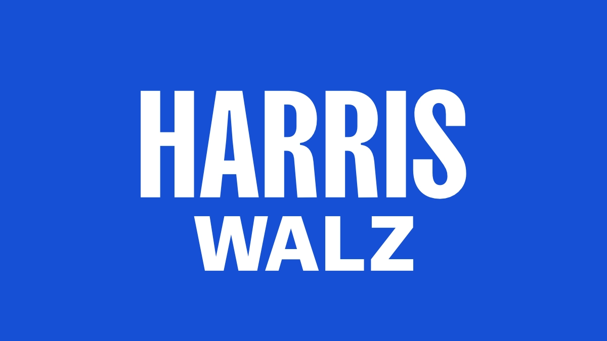
The evolution of presidential campaign logos in the United States reflects not only the changing aesthetics of design but also the strategic branding choices that candidates make to connect with voters. The Harris-Walz logo, with its minimalist design that resembles a Hershey's chocolate bar wrapped in a Bud Light packaging, is a significant departure from the more elaborate logos of past campaigns.
While it lacks any embellishments, and features a straightforward color palette of black-on-white and white-on-blue, the logo design is a deliberate move by Vice President Kamala Harris to imprint her identity on the campaign she inherited from President Biden. It does align with a broader trend toward simplicity and directness in political branding influenced by the social media age.
Historically, presidential campaign logos have relied on patriotic symbols and the American flag to invoke that sense of patriotism and unity, aiming to resonate with a broad audience. But as humankind matures (one would hope so), the design elements for political campaigns has evolved too.

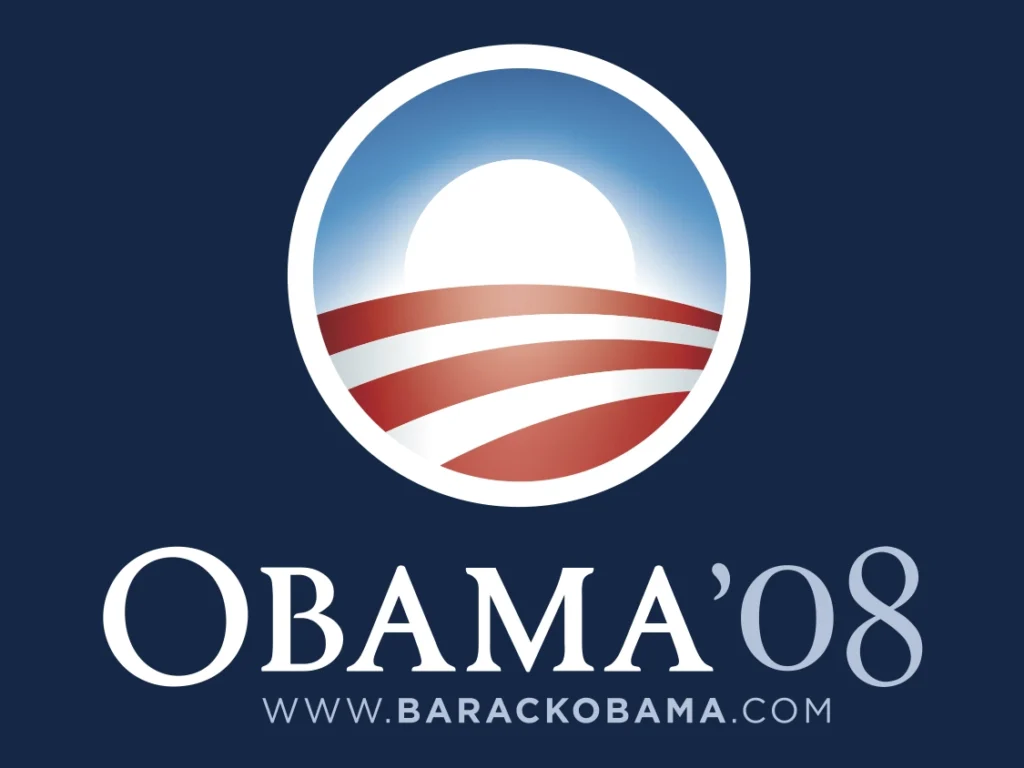
Barack Obama's 2008 campaign logo, designed by Sol Sender, cleverly reimagined the American flag as a rising sun, symbolizing hope and renewal. This design was not only visually striking but also aligned with Obama's message of change and unity, leveraging the circular shape as a symbol of inclusiveness and completeness. The Obama 2008 logo used the serif font Requiem and the sans-serif font Gotham, both designed by the Hoefler & Co foundry.

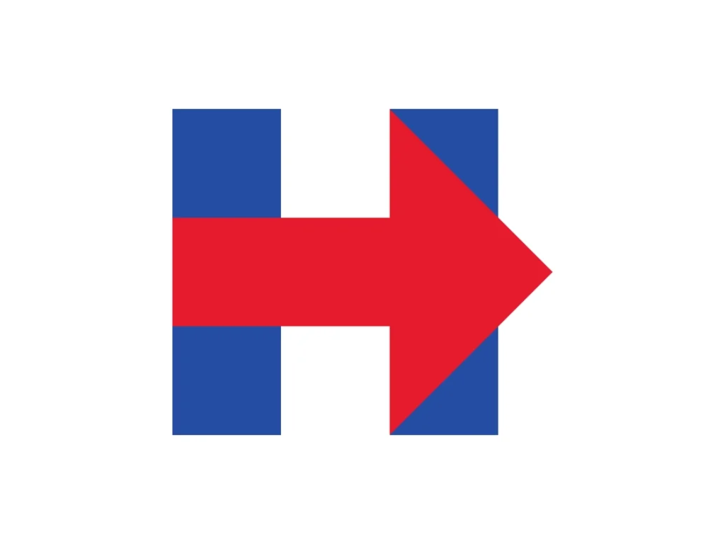
Hillary Clinton's 2016 campaign logo, designed by Michael Bierut and his team at Pentagram, utilized a bold "H" with an arrow pointing forward, signifying progress. The logo originally had very diverse reactions. While some called it outright trash, others praised it for being perfect. The logo indeed was very versatile and symbolic. It was a winner, although Hillary was not.

Harris's previous campaign branding during her 2020 presidential run, designed by the Wide Eye Creative Agency was vibrant and bold. And, more importantly, it paid homage to Shirley Chisholm, the first Black woman to run for a major party presidential nomination. Chisholm's campaign was known for its bold all-caps slogans, a style Harris emulated with her own slogans like "Tough. Principled. Fearless." The new logo, while not identical to the 2020 design, features tall lettering reminiscent of her earlier campaign and nods to Chisholm's historic run.
The use of design elements such as lines or stars, reminiscent of the American flag, remains a popular choice for evoking national pride. The Harris-Walz logo's departure from these traditional symbols might suggest a strategic pivot to emphasize the candidates' liberal ideology and policy platforms over conventional patriotic and jingoistic imagery that is often associated with the right-wing. The Trump-Vance logo does use all the necessary ingredients to invoke that sense of patriotism: stars, slogan and the quintessential colors: red, white, and blue.
The shift toward minimalist design in political logos can be seen as a response to the digital age, where logos must be versatile enough to function across various platforms, from social media to traditional print. This trend is not unique to the Harris-Walz campaign; many modern campaigns have adopted simpler designs that focus on the candidate's name or initials, sometimes incorporating a first-name basis to foster a sense of familiarity and approachability.

